Hi crafty friends! Today I’m sharing a cozy, retro-inspired card project that’s straight from the heart of the kitchen. This playful design features some of my favorite Honey Bee Stamps products — perfect for anyone who loves baking, vintage charm, … Continue reading →
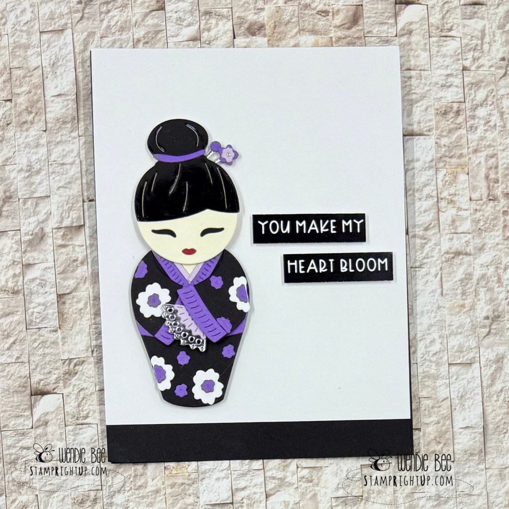
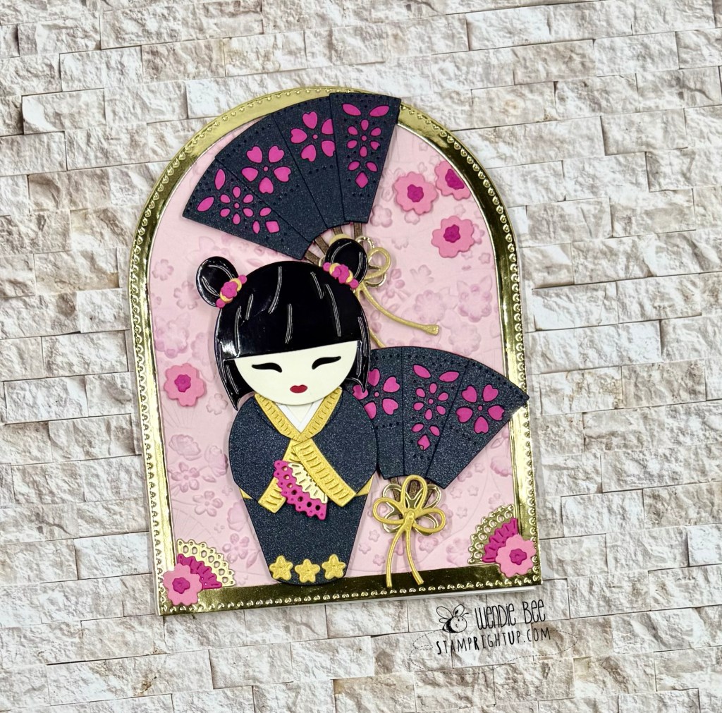
These gorgeous projects are brought to life with the enchanting Spring in Kyoto collection from Spellbinders — and let me tell you, this die set is nothing short of magical!
Inspired by the charm and tradition of Japanese Kokeshi dolls, the intricate layering dies let you build sweet, stylized figures with endless customization options. From the delicate fans and hair accessories to the beautifully detailed kimonos, this set allows for both minimalist elegance and maximalist flair — depending on your creative mood.
For my first card, I went clean and simple with a bold black, white, and violet palette, letting the doll and sentiment truly shine against a crisp background.
The second design leans fully into the ornate beauty of the collection, featuring layered fans, stitched blossoms, and metallic accents that make it feel like a miniature art piece.
Whether you’re crafting for love, friendship, or just to celebrate beauty in the everyday, these Kokeshi dies are the perfect focal point for a heartfelt handmade card.
✨ Craft tip: Paper piecing with glossy cardstock adds that perfect lacquered finish to mimic real Kokeshi dolls — and foam tape gives just the right amount of dimension.
Would love to know — are you team minimalist or maximalist when it comes to cardmaking?
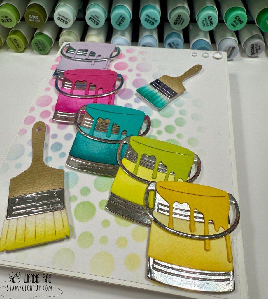
Talk about a burst of crafty color! This cheerful card was created using the Paint the Town and Paint Brush die sets from Taylored Expressions, and I couldn’t be more in love with the results.
Based from the inspiration tutorial on the TE YouTube channel, this die duo is perfect for rainbow lovers, art enthusiasts, or anyone who wants to send a splash of happy.
The paint cans and brushes come to life with endless color possibilities — I used bold ombré ink blending to give each can its own personality, then layered them on a softly stenciled background of colorful bubbles for a little extra pop and playfulness.
Adding just a few bubble drops in each corner for balancing accents, they added that perfect polished touch, while the layering design of the brushes and dripping paint make the whole scene feel dynamic and dimensional.
Taylored Expressions Paint The Town card by Wendie Bee Stamp Right Up
💡 Pro tip: Try popping up a few of the paint cans with foam squares for even more visual depth — and don’t be afraid to mix up your color order for a quirky, artistic vibe!
Whether you’re crafting for a birthday, thank you, or just because, this set makes it so fun to send a message that says: “You color my world.”
Let me know what colors you’d use to paint your own crafty masterpiece!
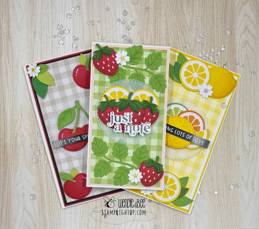
Fruitful Trio of Cards with Lawn Fawn! 🍒🍓🍋 Hello crafty friends! Today I’m excited to share a berry sweet set of cards I made using some of my favorite Lawn Fawn goodies! These fruity cards are bursting with color and … Continue reading →
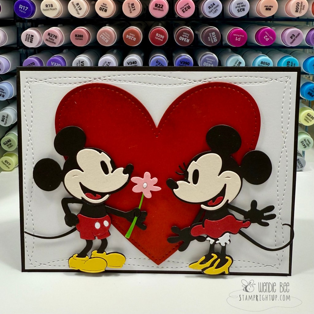
Who says Steamboat Willie has to stay black and white? I had an absolute blast putting a fresh spin on the Spellbinders Steamboat Willie Die Set — transforming it into a sweet and colorful tribute to everyone’s favorite couple: Mickey & Minnie Mouse!
This card is a playful twist on a classic. I brought the vintage-style silhouette dies to life with vibrant cardstock to match Mickey and Minnie’s iconic color palettes — bold red, sunny yellow, and of course, classic black and cream. I paired the duo with a large, stitched red heart to give it that unmistakable lovey-dovey vibe, perfect for Valentine’s Day, anniversaries, or just a little everyday magic.
The dimensional layering of each element really makes the characters pop — just look at those eyelashes and Minnie’s shoes! And the little flower? Swoon. It’s the tiniest touch that brings this whole scene together.
💡 Craft tip: Don’t be afraid to break from the original color scheme of a die set — especially when it gives you room to reimagine beloved characters in your own style!
Whether you’re a Disney die-hard or just love making character-inspired cards, this is one die set that’s full of potential beyond the steamboat.
Let me know in the comments — are you team Mickey or team Minnie?
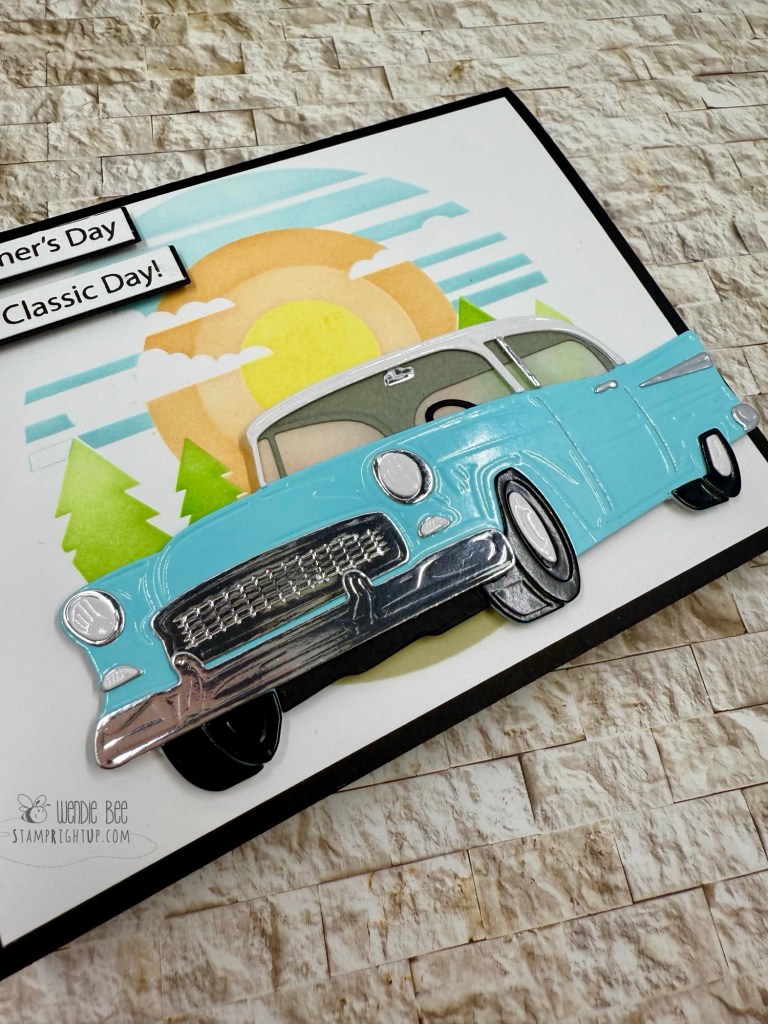
Every year me and my dad go to a local car show on Vancouver Island called the Show & Shine in Qualicum Beach
This year with my health not being so great. I was concerned I wasn’t able to make it so I wanted to make sure that he didn’t miss out.
Seeing this Classic Card collection from Mindy Egan for Spellbinders was perfect, and I knew it as soon as I saw it! I made sure that I got it the second it was released. and I made him a card from what I can remember of the cars he always points out as some of his favourites.
Using the layered stencil set long with the classic car die set and the stamp set I made the scene as bright and happy as I could.
I had also purchased the glossy pastel cardstock from Scrapbook.com exclusively for this project knowing it would make the car & tires really pop. It’s perfect! Next up: to try: glossy red!
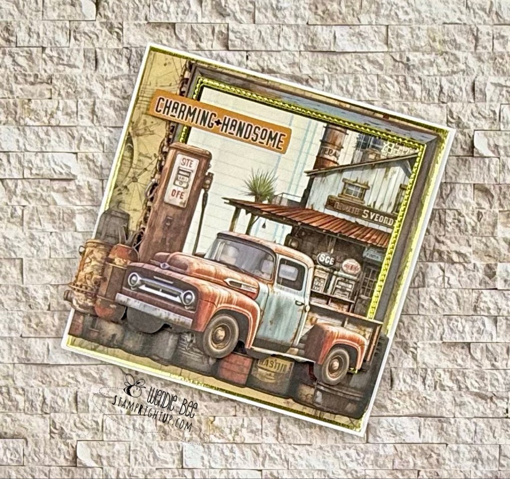
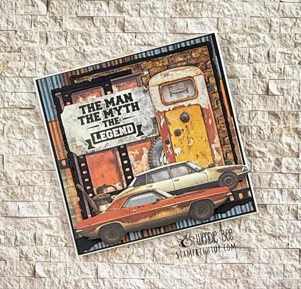
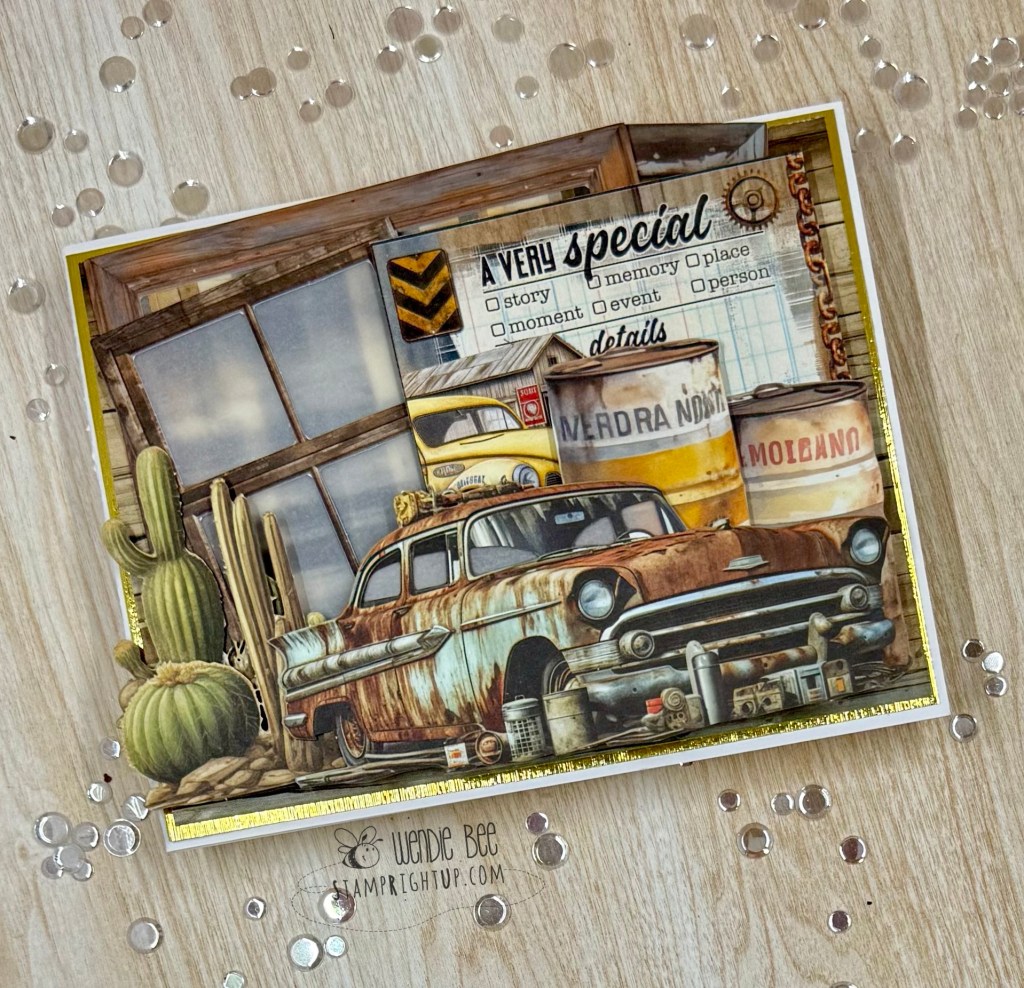
Grit, Gears & Grunge — The Charm of Rust & Rev 🚙🛠️🧡
I’m so excited to share a full lineup of projects created with the 49 and Market Rust & Rev and Rust & Rev 2.0 collections — a perfect match for those who love a gritty, vintage aesthetic packed with texture, tools, and rugged retro charm.
From rusted pickups to vintage gauges, oil-stained textures, and gear-filled workbenches, these collections are brimming with bold masculine energy. Some of these cards were born out of a workshop led by the incredibly talented Deanna Hutchinson at Clipper Street Scrapbook Company in Langley, and others were built from scratch at home as I got more and more inspired by the elements in these kits.
Each design is layered with dimensional die cuts, weathered textures, and industrial ephemera that tell a story — whether it’s one of resilience, grit, or just good old-fashioned horsepower. Sentiments like “Built for This,” “The Man, The Myth, The Legend,” and “The Best View Comes After the Hardest Climb” make these cards ideal for Father’s Day, birthdays, or for anyone who appreciates the beauty in patina and the pride of a well-worn toolbox.
💡 Design tip: Lean into the grunge! Use inked edges, distressed layers, and mixed media elements to enhance the raw, mechanical feel of the collection. And don’t be afraid to go full 3D with your embellishments — bolts, chains, and gauges are all fair game!
Big thanks to Diana for the inspiration and instruction — and if you’re a fan of masculine themes or automotive nostalgia, this collection is a must-have.
Got a favorite from the batch? Let me know which card revs your creative engine the most!
I have been a member of Online Card classes founded by Kristina Werner and friends for many years. There are some great classes that I go back to when I am really stuck for inspiration.
This past Christmas, Kristina curated a specially designed & curated set for a workshop on the OCC platform. This was the first time they had provided product bundles and I loved it. There was a range of cards to suit all tastes & skill.
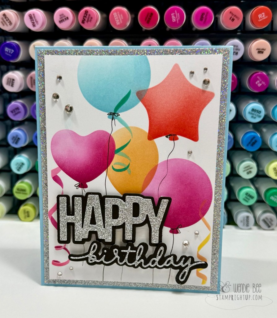
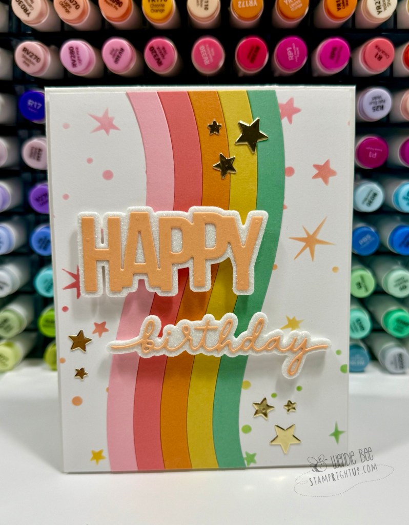
Kristina recently curated another product bundle called “Celebration”. I immediately registered and purchased the products; celebration & birthday cards are always a staple to have on hand & to create.
Congratulations and general “Yay for you” cards aren’t something I usually have in my stash, so I made a point to create a general “yay” card to have handy. Keeping the color palette bright and happy keeps it gender neutral so that I can easily give it to any recipient
Concord & 9th ink cookies: Aqua Sky, Wildberry, Buttercup (shaded with Creamsicle), Poppy, Pink Lemonade (shaded with the brush used for Wildberry balloon)
All of my cards were inspired from the projects from the workshop. We received the Workshop PDF in advance so I went rogue and started creating before the class videos came out.
There are a few projects I had trouble with creating in my own so I am looking forward to the instructional videos from the instructors for more projects to add to my stash.
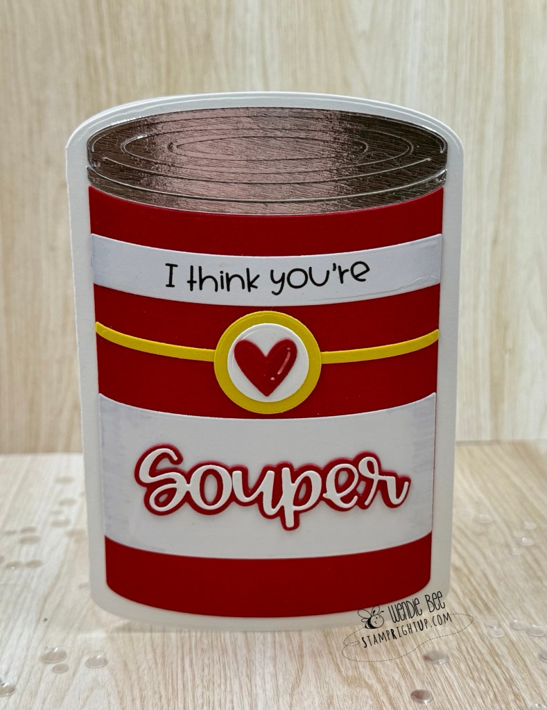
This might just be my favorite kind of comfort crafting! I had so much fun creating this shaped card using the Soup Can Card Die Set from Trinity Stamps — and let’s be real, who doesn’t love a good pun?!
This clever die set builds a full soup can card base, complete with embossed metallic “lid” details and bold wrap-around stripes reminiscent of a certain iconic pantry staple. I layered mine with classic red and white cardstock for a clean, bold look and added the included sentiment die and heart embellishment for a pop of sweetness.
The finished card is not only adorable — it stands up on its own, making it perfect for displaying on a shelf or desk. And while I went with a Valentine-esque “I think you’re Souper” theme, this set is incredibly versatile! Think get well soon, teacher appreciation, friendship, or just a warm note to make someone smile.
💡 Design tip: Use metallic or mirror cardstock for the lid to mimic real tin, and don’t be afraid to mix up the color palette for themed cans — think spooky soup for Halloween or festive tomato-chili for Christmas!
If you love shaped cards or just enjoy spreading punny positivity, this die set belongs in your stash.
Would love to know — what flavor of “souper” sentiment would you cook up with this die?
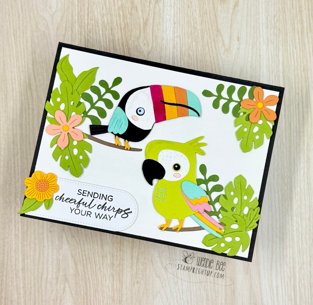
Get ready to turn up the color and the cuteness — this card was made using the Spellbinders Small Die of the Month: Tropical Friends and it’s giving all the sunny, vacation vibes!
This playful set features a colorful toucan and parrot duo, along with an assortment of leafy greenery and tropical blooms to help you build the ultimate jungle scene. I had so much fun choosing bold, vibrant colors to bring these feathered friends to life. (That rainbow beak? Obsessed.)
The sentiment “Sending cheerful chirps your way” from the Spellbinders adjacent collection “Cheerful Chirps”, it ties it all together and makes this card perfect for birthdays, thank-yous, or just a little happy mail to brighten someone’s day. I layered everything on a crisp white background with a black card base for contrast, letting the colors really pop.
💡 Craft tip: Don’t be afraid to use colors for your birds that aren’t realistic! It’s ok to have imagination!
Also, by mixing multiple shades of green when building your tropical foliage — you add depth and helps balance the bright bird colors beautifully.
Whether you’re a bird lover, a tropical theme fanatic, or just want to try something bold and fun, this die set is a must-have for summer crafting.
Tell me in the comments — which bird is your favorite: the sassier toucan or the sunny parrot?