The Secret Ingredient
Some cards come together exactly as planned, and others evolve as you play with the pieces on your desk. This card was definitely the latter.
I started with the kitchen tools as my focal point. There’s something so charming about a wooden spoon, whisk, and spatula—simple tools that instantly bring to mind baking days, family recipes, and homemade treats. Rather than creating a traditional cooking-themed card, I wanted the design to feel soft, feminine, and full of warmth.
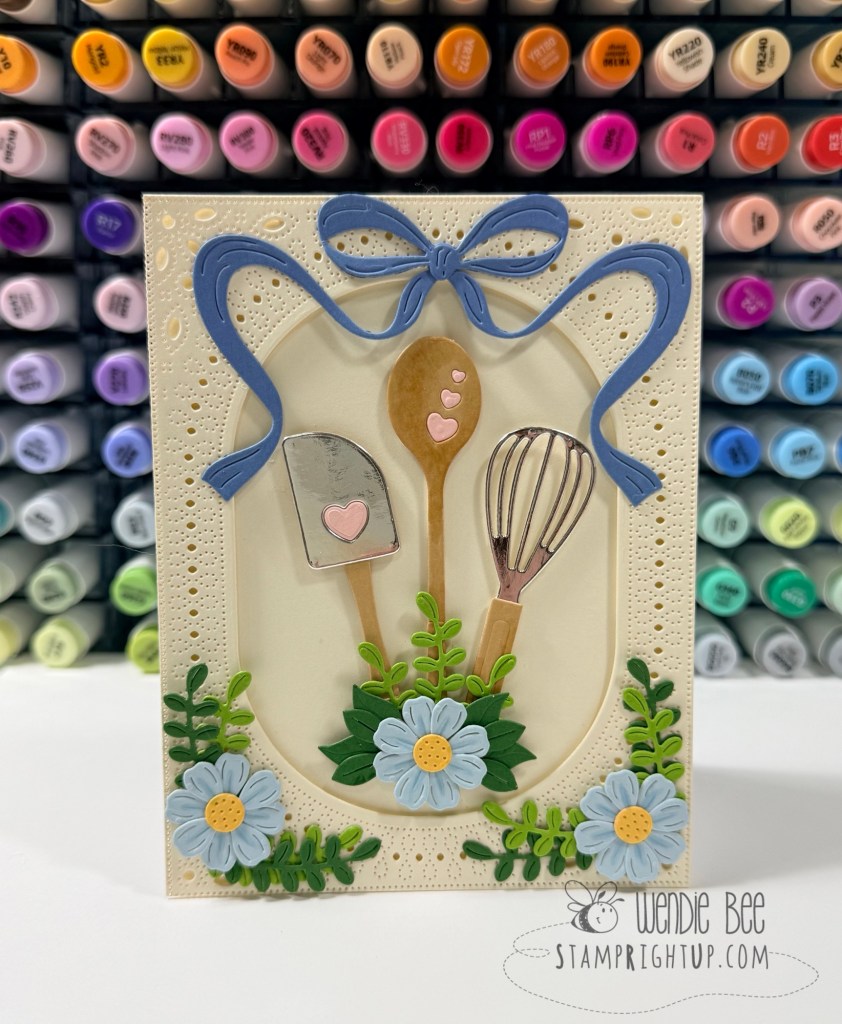
To create the frame, I die cut an oval opening and layered it over a beautifully detailed pierced background. The oval naturally draws the eye to the center of the card while giving the design a clean and elegant structure.
A large periwinkle bow from Gidting Bows set frames the top of the card and adds movement to the design. I love how the flowing ribbon softens the geometric shape of the frame and creates a wonderful sense of balance. To finish everything off, I tucked clusters of blue flowers and layered greenery around the base of the utensils, creating the appearance of a sweet floral arrangement growing from a favorite collection of kitchen tools.
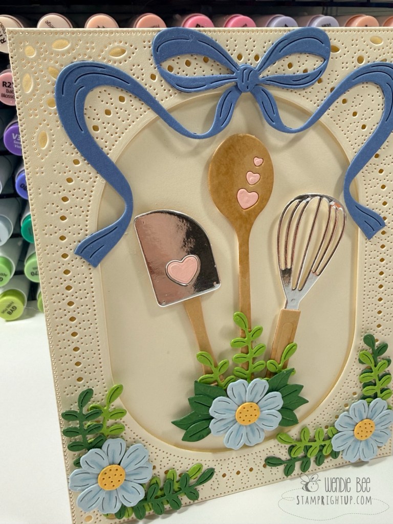
Sometimes the best cards tell a story without needing a sentiment. For me, this one celebrates homemade goodness, cherished family recipes, and the joy of creating something with your own two hands.
Supplies Used
- Spellbinders Mixing It Up Etched Dies
- Spellbinders Essential Stylish Ovals
- Spellbinders Gifting Bow Etched Dies
- Spellbinders Color wheel Essentials Cardstock
I still think “The Secret Ingredient” would make a fantastic title for this one, especially if you decide to add a sentiment later that says something like Made with Love or Baked with Love. ❤️