Every now and then, my creativity needs a little helping hand.
Living with an autoimmune disorder means there are days when I’m simply not up for designing something from scratch. Instead of putting my supplies away, I love to CASE (Copy And Share Everything/Copy And Selectively Edit) projects from talented artists. It’s a wonderful way to keep creating, learn new techniques, and most importantly, find a little joy on the days when my body and brain aren’t cooperating.
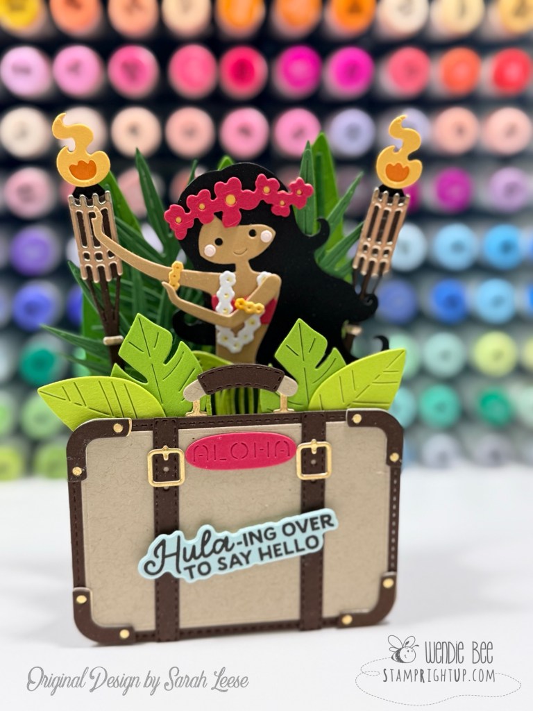
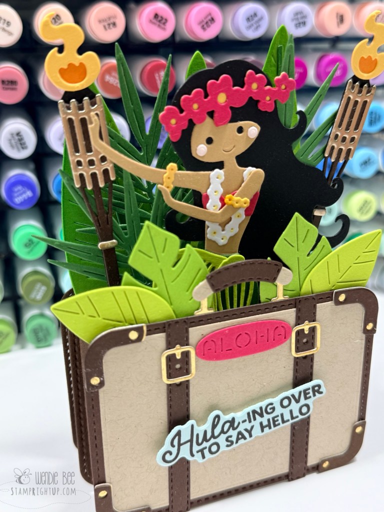
This adorable suitcase box card is slight variation on the beautiful original design by Sarah Leese. I fell in love with her version and recreated it almost exactly, with slight edits for a few of my own little touches. I firmly believe it’s perfectly okay to recreate another artist’s work, as long as you give credit where it’s due and never claim the design as your own.
A huge thank you to Sarah Leese for sharing both her creativity and a fantastic tutorial showing exactly how to make these fun 3D suitcase box cards. If you’d like to make one yourself, you can watch her tutorial here:
There’s something magical about the nostalgia of old movie theaters—the paper tickets, glowing marquees, buttery popcorn, and the excitement of settling into your seat before the show begins. When I opened the Simon Says Stamp June 2026 Card Kit, Step Right Up, I immediately knew I wanted to lean into that vintage cinema aesthetic rather than the carnival theme showcased in many of the kit samples. The combination of Tim Holtz-inspired elements, vintage tickets, and dimensional popcorn made it the perfect foundation for a movie-themed collection of cards.
The Step Right Up kit is packed with exclusive goodies including the 3D Popcorn Box Die, White Heat & Fluff, ticket-themed dies, vintage-inspired card panels, and a Tim Holtz Idea-ology Ticket Book. For these projects, I also incorporated the Tim Holtz Cling Rubber Stamps – At The Movies stamp set to reinforce the classic theater theme and add additional vintage imagery and typography.
Creating Realistic Popcorn
The star of every card in this collection is undoubtedly the popcorn! I die cut multiple popcorn pieces using the kit’s exclusive 3D Popcorn Box die and then applied the included White Heat & Fluff to create wonderfully dimensional kernels. After heating, the texture transforms into realistic-looking popcorn that practically jumps off the card front. It’s one of those techniques that never gets old and adds incredible tactile interest.
To give the popcorn a buttery appearance, I lightly inked the pieces with warm yellow tones before assembling the overflowing popcorn boxes.
Card One: Making Memories at the Movies
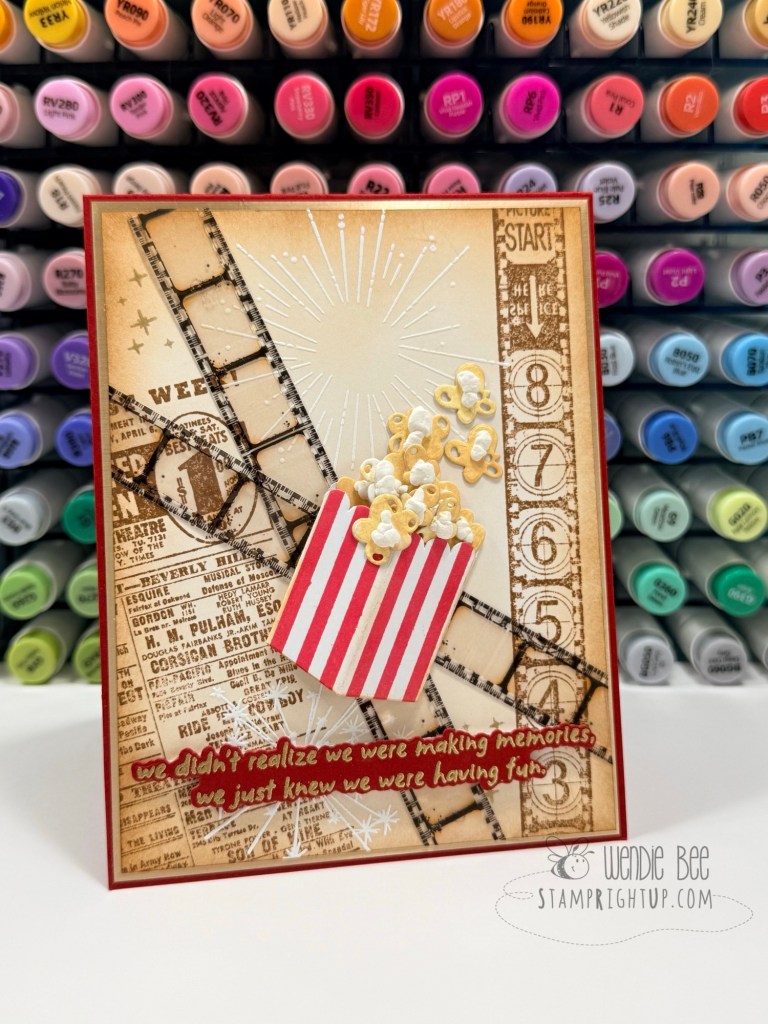
For the first card, I created a vintage movie collage featuring distressed film strips layered across a background stamped with imagery from the At The Movies set. A large spotlight burst draws the eye toward the center while the overflowing popcorn box anchors the design.
The sentiment, “We didn’t realize we were making memories, we just knew we were having fun,” perfectly captures the feeling of movie nights with family and friends. The combination of aged neutrals, rich red accents, and vintage ephemera creates a timeless look that feels both nostalgic and elegant.
Card Two: Popcorn Explosion
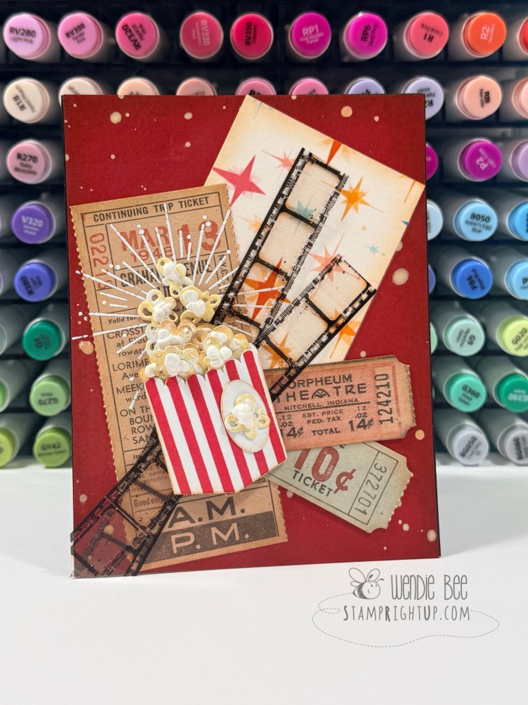
For the second card, I embraced a more playful composition. Vintage ticket pieces from the Tim Holtz Idea-ology Ticket Book were layered behind a large popcorn box, creating the feeling of a movie night collage board.
I love how the black film strips weave through the design, connecting all of the elements while helping direct the eye around the card. The distressed ticket pieces add authenticity and reinforce the old-fashioned cinema vibe.
Card Three: Admit One
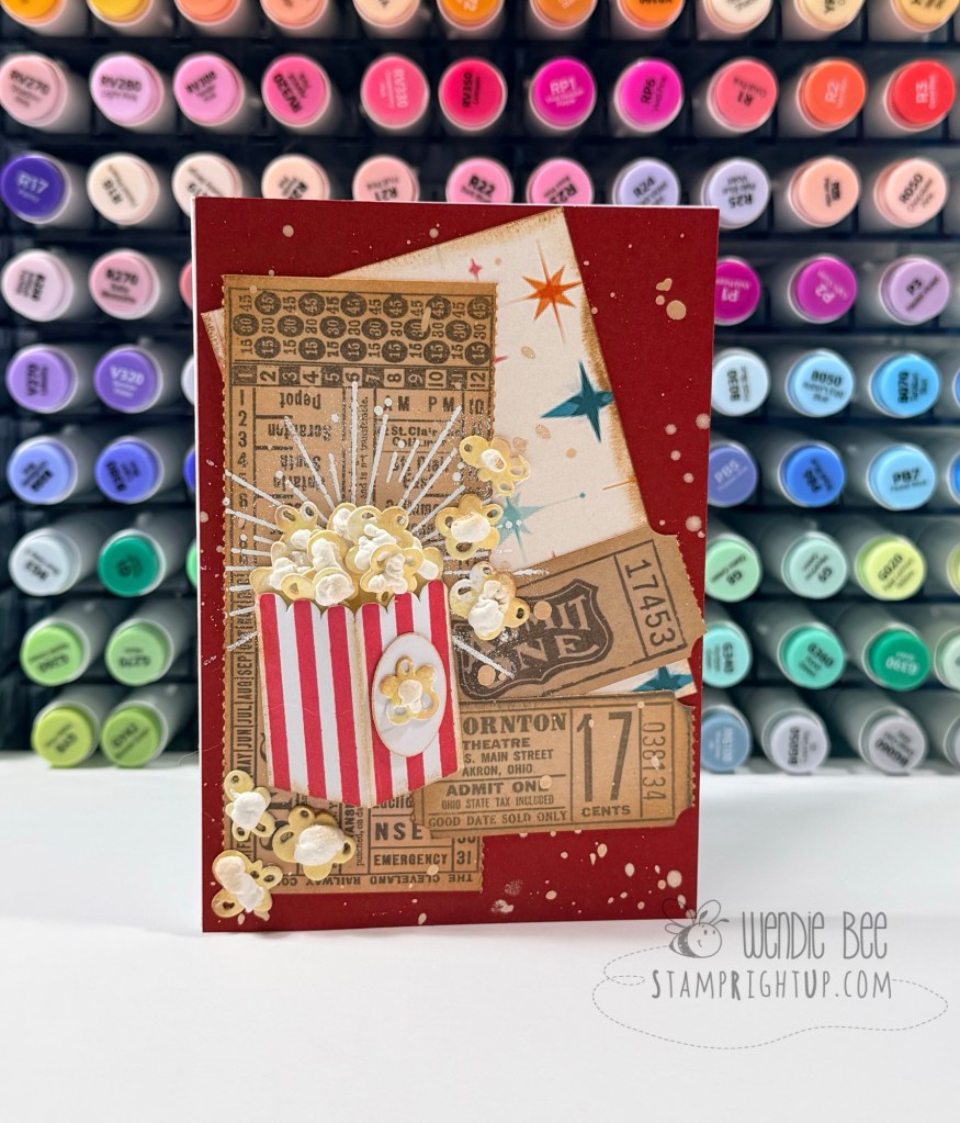
The final card continues the vintage theater theme with additional ticket book elements arranged into a layered background. The colorful starburst patterned paper from the kit peeks through the design, adding a fun retro feel without overwhelming the vintage aesthetic.
The popcorn box once again takes center stage, but this time the surrounding ticket elements become part of the storytelling—almost like a collection of keepsakes saved from favorite movie nights over the years.
Bringing the Theme Together
One of my favorite things about this kit is its versatility. While the Step Right Up theme naturally lends itself to carnivals and fairs, the inclusion of tickets, popcorn, and vintage-inspired elements made it easy to shift the focus toward classic movie theaters and cinema memories. The addition of the Tim Holtz At The Movies stamp set helped tie everything together beautifully and reinforced the nostalgic storytelling aspect of each card.
These projects are a reminder that card kits don’t have to be used exactly as intended. Sometimes the most creative designs come from looking at the components through a different lens and finding a theme that speaks to you.
Whether you’re creating cards for movie lovers, scrapbook layouts documenting family outings, or simply celebrating happy memories, this combination of vintage tickets, film strips, and fluffy popcorn is guaranteed to bring a smile.
Some cards come together exactly as planned, and others evolve as you play with the pieces on your desk. This card was definitely the latter.
I started with the kitchen tools as my focal point. There’s something so charming about a wooden spoon, whisk, and spatula—simple tools that instantly bring to mind baking days, family recipes, and homemade treats. Rather than creating a traditional cooking-themed card, I wanted the design to feel soft, feminine, and full of warmth.
To create the frame, I die cut an oval opening and layered it over a beautifully detailed pierced background. The oval naturally draws the eye to the center of the card while giving the design a clean and elegant structure.
A large periwinkle bow from Gidting Bows set frames the top of the card and adds movement to the design. I love how the flowing ribbon softens the geometric shape of the frame and creates a wonderful sense of balance. To finish everything off, I tucked clusters of blue flowers and layered greenery around the base of the utensils, creating the appearance of a sweet floral arrangement growing from a favorite collection of kitchen tools.
Sometimes the best cards tell a story without needing a sentiment. For me, this one celebrates homemade goodness, cherished family recipes, and the joy of creating something with your own two hands.
Supplies Used
Spellbinders Mixing It Up Etched Dies
Spellbinders Essential Stylish Ovals
Spellbinders Gifting Bow Etched Dies
Spellbinders Color wheel Essentials Cardstock
I still think “The Secret Ingredient” would make a fantastic title for this one, especially if you decide to add a sentiment later that says something like Made with Love or Baked with Love. ❤️
If you’re looking for a fun card design for the golfer in your life, this golf-themed card is sure to be a hole-in-one! I created this A2 card using the Hole in One Bundle from Taylored Expressions, featuring the Par for the Course Cutting Plate and Layering Stencils as the star of the show. The bundle includes everything needed to build playful golf scenes complete with fairways, sand traps, water hazards, golf carts, bags, and pun-filled sentiments.
For this card, I kept the focus on the beautifully detailed golf course background. After die-cutting the course from Spellbinders Rainforest cardstock, I used the coordinating stencils and Lawn Fawn inks to bring the scene to life. The fairways were blended with Jalapeño and Celery, while Fish Tank and Kiddie Pool created the soft blue water features. Doe added warm sandy tones to the bunkers, and Crunchy Leaf provided extra depth and shading around the course details.
To keep the design clean and graphic, I added the small flag accents to each green and clustered a few die-cut shrubs around the course. The bright red flags add the perfect pop of color against the lush greens and blues.
The sentiment, “You’re the BEST BY PAR!”, takes center stage and makes this card perfect for birthdays, Father’s Day, retirement celebrations, congratulations, or simply encouraging the golf lover in your life.
Supplies Used
Taylored Expressions Hole in One Bundle
Spellbinders ColorWheel Cardstock:
Rainforest
Fern
Fog
Poppy
Lawn Fawn Ink Pads:
Jalapeño
Celery
Fish Tank
Kiddie Pool
Doe
Crunchy Leaf
I love how the layered stenciling creates so much dimension while still keeping the card relatively flat for mailing. The golf course almost looks like a miniature aerial view, making it a fun and unique design that’s sure to score big with any golfer! ⛳️🏌️♂️
Bright colors, tropical details, and the sweetest summery styling came together for this cheerful card using the May 2026 Spellbinders All Crate Club release! I had so much fun mixing elements from the Pop of Summer Large Die of the … Continue reading →
Discover the whimsical charm of the Hero Arts Don’t Stop Believing Collection, featuring adorable Gentle Giant die sets and stunning underwater scene cards. Perfect for adding a playful touch to your cardmaking projects. Continue reading →
Sweet strawberries, soft florals, and all the springtime vibes! 🍓💕 Today’s card was created with the April 2026 Spellbinders All Crate Club kit, featuring the absolutely adorable Market Berries stencil of the month.
This background came together using the five-layer layering stencil, which makes it so easy to build up all those crisp berry details and soft leafy layers. I love how the delicate pink flowers and bright greens give this card such a fresh farmer’s market feel!
For a little extra dimension, I added die cut strawberries from the coordinating bonus die set included in the All Crate subscription. Layering the die cuts over the stenciled background helps pull everything together while adding a fun focal point around the sentiment.
The sentiment itself comes from the Market Trio Sentiments stamp set, which was also included as part of the bonus items in the crate. “Berry Big Thanks to You!” was the perfect finishing touch for this cheerful thank you card.
Everything was created using Spellbinders cardstock for a clean, bright finish with beautiful color blending throughout.
I especially love how versatile this stencil is — it would be adorable for thank you cards, friendship cards, summer birthdays, or even cute recipe-themed projects. The layered stencil design makes it look detailed and intricate, but it comes together surprisingly quickly once you get going.
This kit was such a fun one to play with, and I can already tell these strawberries are going to make many more appearances in future projects! 🍓
These playful pickleball cards were such a fun change of pace to create! I used the Spellbinders “Born to Dink” stamp and die set to build the layered paddles, then paired them with bright colours, clean textures, and simple embellishments to keep the focus on the bold designs.
The mix-and-match paddle pieces make it easy to customize the look depending on the recipient — from soft florals and pastel tones to bright sporty colours for masculine cards.
For the “Court Queen” card, I softened the sporty theme with florals and leafy accents for a more feminine look, while the “Court King” card leans into a brighter, more graphic style with the net and pickleball taking centre stage. These would be perfect for birthdays, thank you cards, retirement cards, or just for the pickleball enthusiast in your life!
The “Born to Dink” set includes layered paddle dies, a net, pickleball, and a collection of fun sentiments that make creating themed cards quick and easy.
Soft Florals & Gentle Words 💗 Today I’m sharing a couple of cards created with the beautiful Peaceful Petals stamp set by Gina K Design, a set that was truly designed with heartfelt moments in mind. This 6” x 8” … Continue reading →
For this sweet and cheerful card, I couldn’t resist leaning into all the happy, springtime vibes. The adorable mice and florals from the Lawn Fawn Mice Flowers collection instantly set the tone; playful, lighthearted, and just a little bit whimsical. These kinds of sets are my go-to when I want to create something that feels joyful without overthinking it.
I started by building a soft, sunny background with a polka dot pattern paper and some ink blending to keep things light and airy. Then came the star of the show; the dimensional flower! Adding that extra layer really brings the scene to life and gives the card a fun focal point.
Of course, the tiny mice had to make an appearance. I love how they add personality and storytelling to the card, they’re not just decorations, they’re part of the moment. A couple of buzzing bees and simple stamped sentiments tied everything together and kept the design feeling clean but complete.
This card is the perfect reminder that sometimes the simplest messages, paired with a bit of dimension and a whole lot of cute, are the ones that mean the most.