There’s something extra special about a class that blends playful design with meaningful messages—and that’s exactly what we got in the “Shiny New Day” workshop at CROP & CREATE Spring 2026, led by the incredibly talented Kim Kesti for Spellbinders.
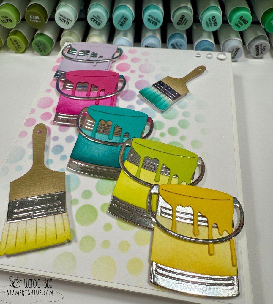
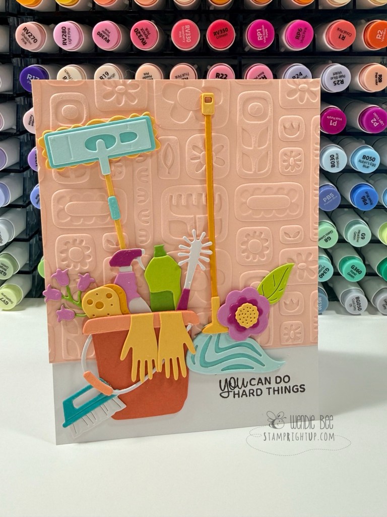
This class was all about turning everyday cleaning supplies into bright, cheerful works of art. Think mops, buckets, sprays, and scrub brushes—brought to life in the happiest spring color palette. The combination of layered die cuts and textured embossing created so much depth, while still keeping everything light, fun, and totally uplifting.
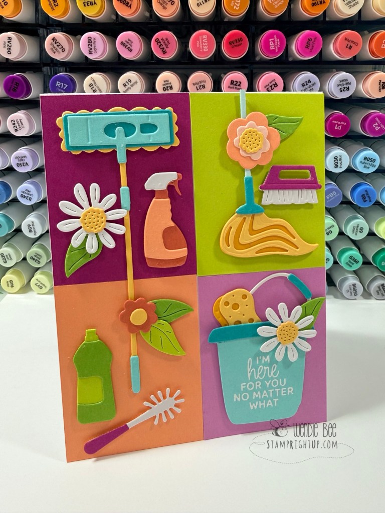
What I loved most about this set was the messaging. These aren’t just cute cards—they’re encouraging, relatable, and honestly kind of perfect for real life.
“Life is messy. You’ve got this.” “You can do hard things.” “I’m here for you no matter what.”
It’s such a clever way to pair the theme with sentiments that truly resonate.
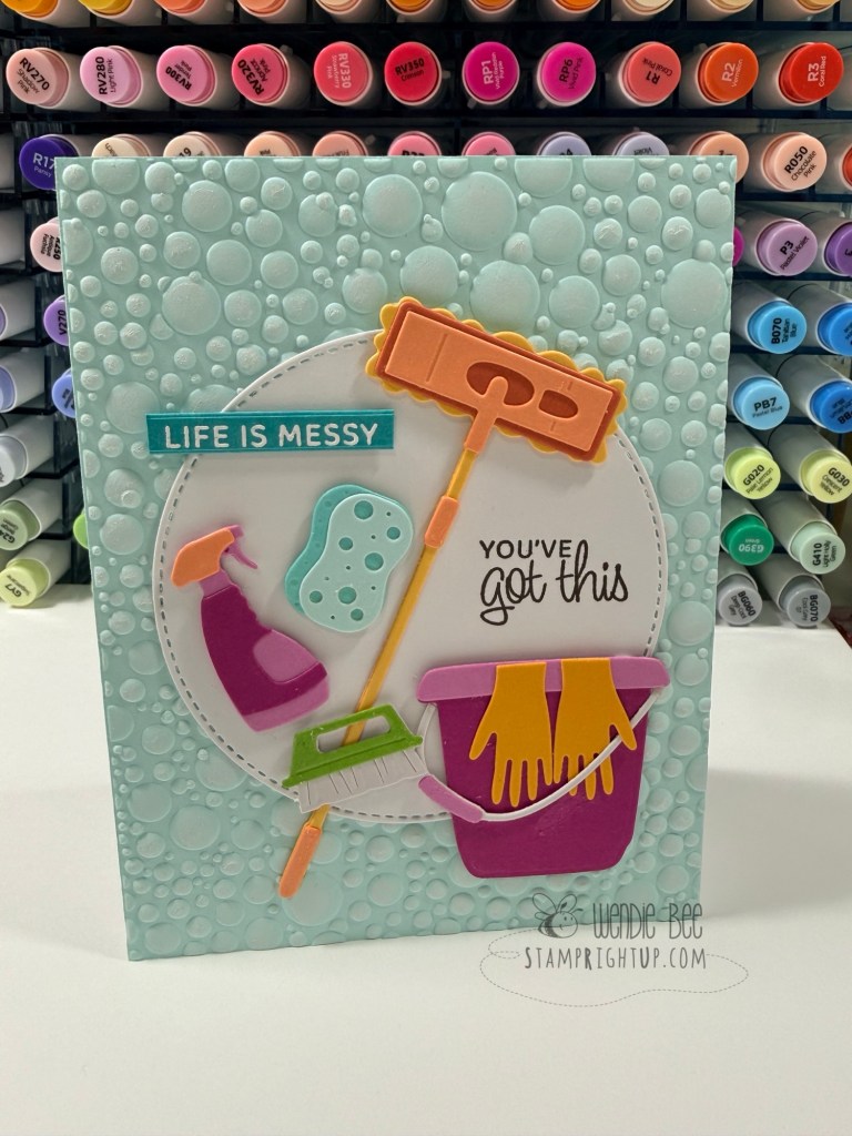
All in all, this workshop was a perfect reminder that even the messiest days can turn into something beautiful—with a little creativity (and maybe a cute mop die cut 😉).
Color palette used:
- Orchid
- Mulberry
- Rainforest
- Peridot
- Seaside
- Waterfall
- Teal Topez
- Beeswax
- Saffron
- Bellini
- Coral
- Sicily
If you try your own version of these cards, I’d love to see what you create 🧽🫧🧼🧹