Classic Cars by Mindy Eggen for Spellbinders – Father’s Day Card

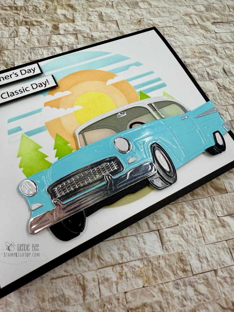
Every year me and my dad go to a local car show on Vancouver Island called the Show & Shine in Qualicum Beach

This year with my health not being so great. I was concerned I wasn’t able to make it so I wanted to make sure that he didn’t miss out.

Seeing this Classic Card collection from Mindy Egan for Spellbinders was perfect, and I knew it as soon as I saw it! I made sure that I got it the second it was released. and I made him a card from what I can remember of the cars he always points out as some of his favourites.

Using the layered stencil set long with the classic car die set and the stamp set I made the scene as bright and happy as I could.

I had also purchased the glossy pastel cardstock from Scrapbook.com exclusively for this project knowing it would make the car & tires really pop. It’s perfect! Next up: to try: glossy red!

49th & Market Rust & Rev’s Collection

Grit, Gears & Grunge — The Charm of Rust & Rev 🚙🛠️🧡

I’m so excited to share a full lineup of projects created with the 49 and Market Rust & Rev and Rust & Rev 2.0 collections — a perfect match for those who love a gritty, vintage aesthetic packed with texture, tools, and rugged retro charm.

From rusted pickups to vintage gauges, oil-stained textures, and gear-filled workbenches, these collections are brimming with bold masculine energy. Some of these cards were born out of a workshop led by the incredibly talented Deanna Hutchinson at Clipper Street Scrapbook Company in Langley, and others were built from scratch at home as I got more and more inspired by the elements in these kits.

Each design is layered with dimensional die cuts, weathered textures, and industrial ephemera that tell a story — whether it’s one of resilience, grit, or just good old-fashioned horsepower. Sentiments like “Built for This,” “The Man, The Myth, The Legend,” and “The Best View Comes After the Hardest Climb” make these cards ideal for Father’s Day, birthdays, or for anyone who appreciates the beauty in patina and the pride of a well-worn toolbox.

💡 Design tip: Lean into the grunge! Use inked edges, distressed layers, and mixed media elements to enhance the raw, mechanical feel of the collection. And don’t be afraid to go full 3D with your embellishments — bolts, chains, and gauges are all fair game!

Big thanks to Diana for the inspiration and instruction — and if you’re a fan of masculine themes or automotive nostalgia, this collection is a must-have.

Got a favorite from the batch? Let me know which card revs your creative engine the most!

🛠️ Wendie Bee | @stamprightup

This Calls For Confetti Stamptember Exclusive ~ Unbelievably Bigfoot Card

I have had this stamp / die / stencil combo since September. It was the Simon Says Stamp Stamptember 2024 This Calls For Confetti exclusive. I got the foot print add-on stencil separately.

Is it perfect? Absolutely not. This card is for my Dad, he’s my favorite person in the whole world. Will HE notice all the little hiccups that I do? Definitely not.

We’re our own worst critics. I bet the love & thought put into a card erases any ‘mistakes’ we might make in the eyes of the recipient.

So rather than trying to be perfect or waiting, SEND THE CARD!!! 💝

Craft O Clock Mists Of Toolbox Town Steampunk I spired Masculine Mini Slimline Card

Every once in a while I come across a collection that may not be my usual go to theme / style, but I could not resist this Mists Of The Toolbox collection from Craft O’Clock when I saw it in my local craft store.

Over the years I have accumulated a great variety of ‘steampunk’ and masculine style dies. So I pulled them out to accent the hot air balloon I had chosen from the “extras” collection cut aparts. Yes, I hate fussy cutting, but these are absolutely worth it. So that the focal piece can appear more seamless, I inked it with Tea Dye distress ink, then used a gold pigment ink pad and ran it along the edge to give it just that little extra pop.

To add a little pop of color I distressed a panel of embossed cardstock in a patina green color I had in my scraps. It was just enough to break the monotony of all the neutrals but still keep with the theme.

Honey Bee Stamps Lovely Layers Owl Masculine Birthday Card

Yet another stunning card using the Lovely Layers Owl die set from Honey Bee Stamps. I wasn’t kidding in my first post using this set that just changing the color ways of your cardstock will give this die set an entirely different look & feel to your project!

This was another project from our Crop & Create Delivered Spring 2023 workshop with Kelly. All that we used was some pattered paper (with just a very light hint of texture). I just added a few white bits throughout the owl, along with some flicks from a matching brown copic marker to give that effect of white & darker feathers.

The evergreen watercolor effect background paper is part of an upcoming release – you will NOT be disappointed, the collection is absolutely stunning.

This die set is incredibly easy to use!! Honey Bee Stamps Lovely Layers die sets may look intimidating, but they provide layering guides, and a ton of inspiration projects for you to run with when creating your own projects.

Zesty Lemon Die & Pink Fresh Studio Hot Foil Sentiment

I had cut a few extra pieces from my first Zesty Lemon card, so I thought I would create this card based on a card Chari Moss created for Lawn Fawn’s release of the set recently.

I didn’t have the dies to create the stripes so I used what I had in my stash. The Pink Fresh sentiment in gold hot foiled on white card stock gave it a classic look that could be given to anyone (even our favourite guy). Using the same buttercup yellow glitter paper I created just the slightest drop shadow for the hot fouled sentiment that gave it that extra subtle pop.

Zesty Lemon from Lawn Fawn with hot foiled sentiment from Pink Fresh Studios

Masculine golf themed card

Just a quick post to show all you Stampers a card I cased from Pinterest.

I made it for a good friend of mine who is a golf pro & who I wanted to send a cheery note to.

It was super easy to do!

I will be posting a tutorial exclusive for my Facebook fans so be sure to stop by and click the like button on my page!

20130827-135522.jpg

Stampin Up Pun Fun & Sizzix Flip-it dies tips

I recently made this card for one of my stores that I sell to – it is such a fun card to make!!!

Using Stampin Up’s “Pun Fun” (now retired), I colored the rocket with water color pencils, fussy cut it then popped it up on the base. Using the stamp itself for revference, I hand drew all the little details in fine pointed black pen. Sentiment is from Paper Smooches.

The sizzix Flip-It die was sued to make the base & layers – I trimmed a second color (daffodil delight) down to fit.

**QUICK TIP ON HOW TO CORRECTLY USE THE SIZZIX FLIP-IT DIE**

Have you found that the die was cutting all the way through your card stock – or that the flip-it die cards were falling apart at the scored lines?! I did. It was heartbreaking to go through all the work to make the card just to have it fall apart. So I did some research:


  • Use ONE cutting plate and your CREASE pad!!!  Youtube video’s and other websites will tell you to use two standard cutting plates, but that second plate is what makes the difference.
    • Put your crease pad on the bottom, your Sizzix Flip-It die in the middle, then your card stock and your cutting plate on top.  That should fix any cutting through, or tearing of your scored folds.


Stampin Up Pun Fun with Sizzix Flip-It die

Stampin Up Pun Fun with Sizzix Flip-It die

Manly Masculine All Occasion Cards Tips

Masculine or manly card are always so difficult to come up with.  Most stamps that are ‘masculine’ are very traditional – so I found I had to think outside the box when coming up with masculine cards.

Tips on making a card masculine:

  1. Use masculine colors:  this includes ALL neutrals as base colors.  Add splashes of regals for accent colors.
  2. Keep layouts simple.  WE (ladies) love ribbon, bling and sparkles… I know that men may not appreciate embellishments as much as we do.  SO, if you’re going to add embellishments to a masculine card –
    1. use base metal colored brads
    2. making knots with your ribbon, rather than bows
    3. use wood buttons

I have the best boyfriend in the world.  He is SOOO supportive of me with my Stampin Up endeavors and is always ready to help out.  For my last “Boys & Babies” card workshop, he sat at the table with me and punched 50 little circles for the wheels on the baby pram cards, then put the right number of punched out pieces in each card kit – he even knew how to punch and optimize the paper so there was no waste.  Whaddda sweetie!!

So to thank him I made him this card.  I LOVE the new ‘smoky slate’ grey from Stampin up – I used a retired background stamp, stamped in smoky slate ink on whisper white & smoky slate card stock.


Stampin Up Manly Masculine Card

Stampin Up Manly Masculine Card


Do you have any great masculine cards that you have made? I would love to see your work too!  Comment below with a link to your blog ❤


Until next time stampers!

Stampin Up Cake Pops

Hi Stampers!

Here is what I have been up to lately:  CAKE POPS!!

Cake Pops with Stampin Up for Father's Day gift treat

Cake Pops Stampin Up style for Father’s Day gift / treat

These were actually for my partner, who was returning from a week long business trip – I wanted to make something special for him, and I knew he had a sweet tooth.

It occurred to me while I was making them that this would also be a GREAT Father’s day gift as well.  It could be a fun thing for Mom’s to do with kids to make the cake pops, then Mom could get in there with her Stampin Up gear and make the labels.

These are a great manly / masculine gift period – I found the trick is to make sure you use ‘manly’ colors – like the brown sprinkles and neutral colored tags etc.

I pretty much used half of my craft room for this – but you could really use ONE stamp set and they would still look great!

Here is the list of Stampin Up tools I used:

STAMPS:

  • Postage Due
  • Chalk Talk
  • ** I’m missing a few – I will have to check the exact name – stay tuned **

INKS:

  • Crumb Cake
  • Night of Navy
  • Real Red

PUNCHES:

  • Postage stamp
  • Petite curly label
  • 1/2″  circle
  • Chalk talk framelits
  • XL oval
  • Small & large tag punch (retired)


The cello bags came from the dollar store along with the curly ribbon. The candy melts & lolly sticks we got at Michaels.  I made the cake pop stand out of a styrofoam block (also from Michaels) and I wrapped it in kraft paper (meant for sending parcels) and put a ribbon around it to cover up the tape a little bit 😉


**HELPFUL HINTS & TRICKS FOR THIS CAKE POP PROJECT**

  1. The recipe on the Duncan Hines website states to use half the icing tub – I actually only used a QUARTER of the tub.  Using half would probably make your cake pops a little too moist and they may fall off the stick while you are trying to coat them.  Try adding a tablespoon at a time until the mix is moist enough to make a into ball.
  2. To melt the (Wilton) candy / chocolate: use the DEFROST button on your microwave if you do not have a double boiler.

Both of these tips are crucial to the success of your cake pops!  I tried to make cake pops before and it was a disaster.


I am happy to share any info you would like that I may have missed here – simply leave me a comment!

Until next time stampers!