Hi crafty friends! Today I’m sharing a cozy, retro-inspired card project that’s straight from the heart of the kitchen. This playful design features some of my favorite Honey Bee Stamps products — perfect for anyone who loves baking, vintage charm, … Continue reading →
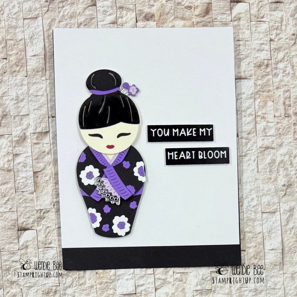
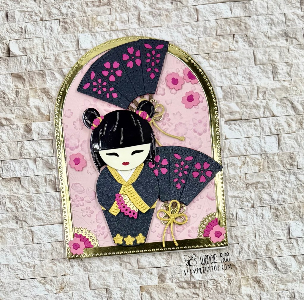
These gorgeous projects are brought to life with the enchanting Spring in Kyoto collection from Spellbinders — and let me tell you, this die set is nothing short of magical!
Inspired by the charm and tradition of Japanese Kokeshi dolls, the intricate layering dies let you build sweet, stylized figures with endless customization options. From the delicate fans and hair accessories to the beautifully detailed kimonos, this set allows for both minimalist elegance and maximalist flair — depending on your creative mood.
For my first card, I went clean and simple with a bold black, white, and violet palette, letting the doll and sentiment truly shine against a crisp background.
The second design leans fully into the ornate beauty of the collection, featuring layered fans, stitched blossoms, and metallic accents that make it feel like a miniature art piece.
Whether you’re crafting for love, friendship, or just to celebrate beauty in the everyday, these Kokeshi dies are the perfect focal point for a heartfelt handmade card.
✨ Craft tip: Paper piecing with glossy cardstock adds that perfect lacquered finish to mimic real Kokeshi dolls — and foam tape gives just the right amount of dimension.
Would love to know — are you team minimalist or maximalist when it comes to cardmaking?
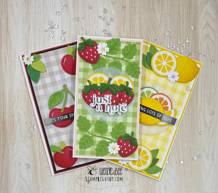
Fruitful Trio of Cards with Lawn Fawn! 🍒🍓🍋 Hello crafty friends! Today I’m excited to share a berry sweet set of cards I made using some of my favorite Lawn Fawn goodies! These fruity cards are bursting with color and … Continue reading →
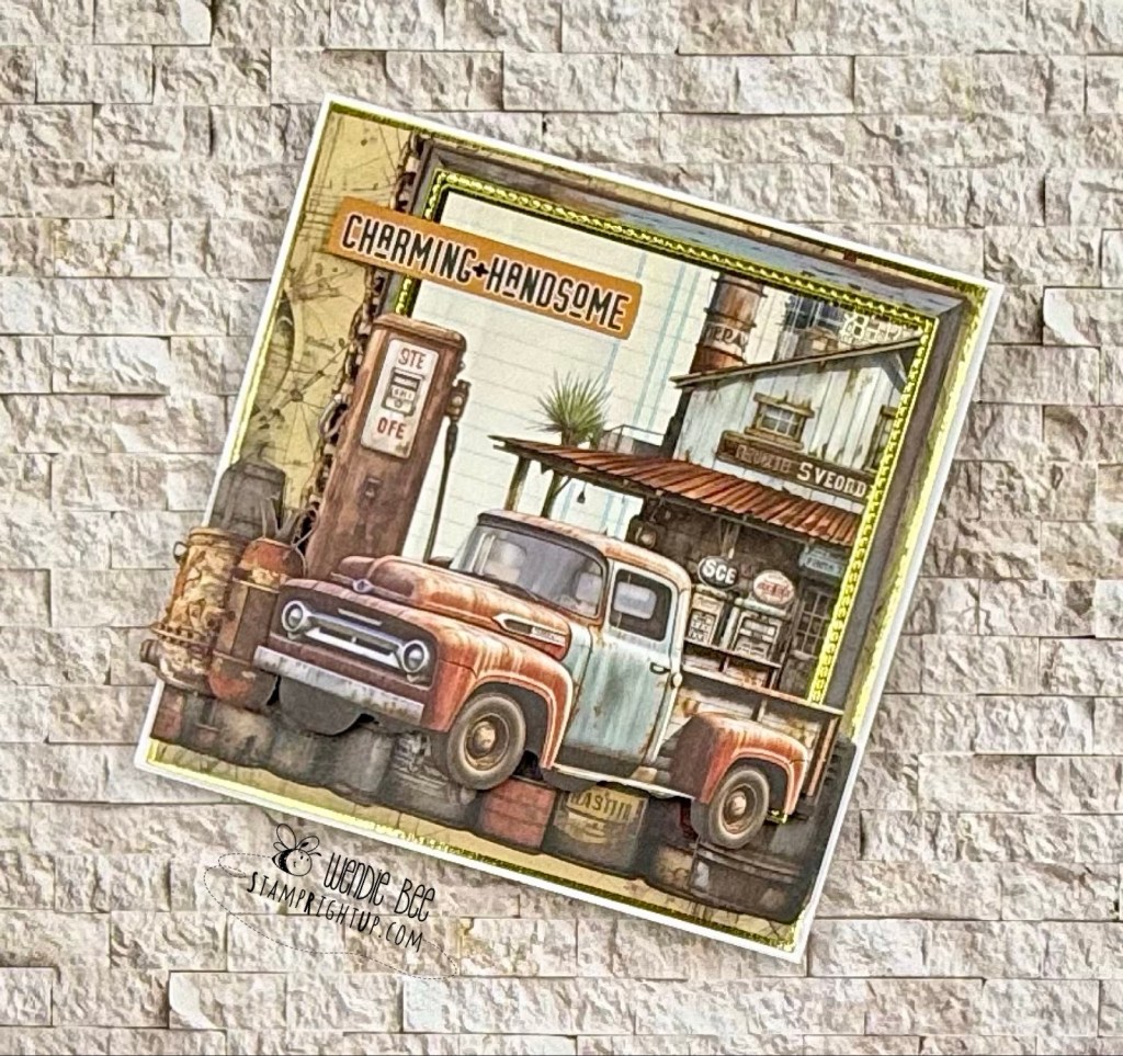
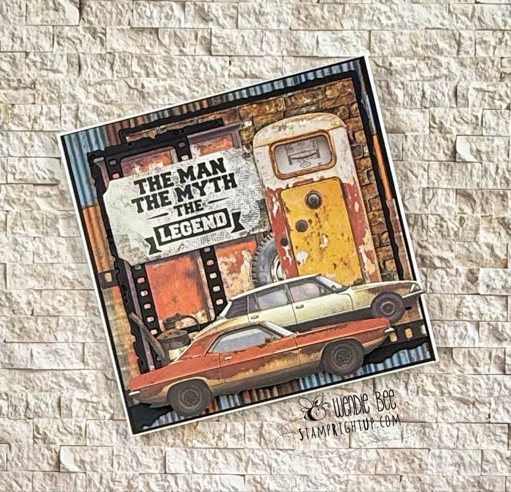
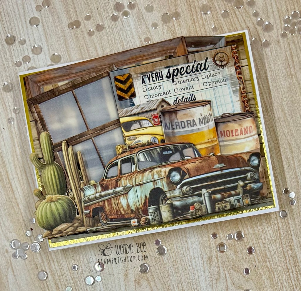
Grit, Gears & Grunge — The Charm of Rust & Rev 🚙🛠️🧡
I’m so excited to share a full lineup of projects created with the 49 and Market Rust & Rev and Rust & Rev 2.0 collections — a perfect match for those who love a gritty, vintage aesthetic packed with texture, tools, and rugged retro charm.
From rusted pickups to vintage gauges, oil-stained textures, and gear-filled workbenches, these collections are brimming with bold masculine energy. Some of these cards were born out of a workshop led by the incredibly talented Deanna Hutchinson at Clipper Street Scrapbook Company in Langley, and others were built from scratch at home as I got more and more inspired by the elements in these kits.
Each design is layered with dimensional die cuts, weathered textures, and industrial ephemera that tell a story — whether it’s one of resilience, grit, or just good old-fashioned horsepower. Sentiments like “Built for This,” “The Man, The Myth, The Legend,” and “The Best View Comes After the Hardest Climb” make these cards ideal for Father’s Day, birthdays, or for anyone who appreciates the beauty in patina and the pride of a well-worn toolbox.
💡 Design tip: Lean into the grunge! Use inked edges, distressed layers, and mixed media elements to enhance the raw, mechanical feel of the collection. And don’t be afraid to go full 3D with your embellishments — bolts, chains, and gauges are all fair game!
Big thanks to Diana for the inspiration and instruction — and if you’re a fan of masculine themes or automotive nostalgia, this collection is a must-have.
Got a favorite from the batch? Let me know which card revs your creative engine the most!
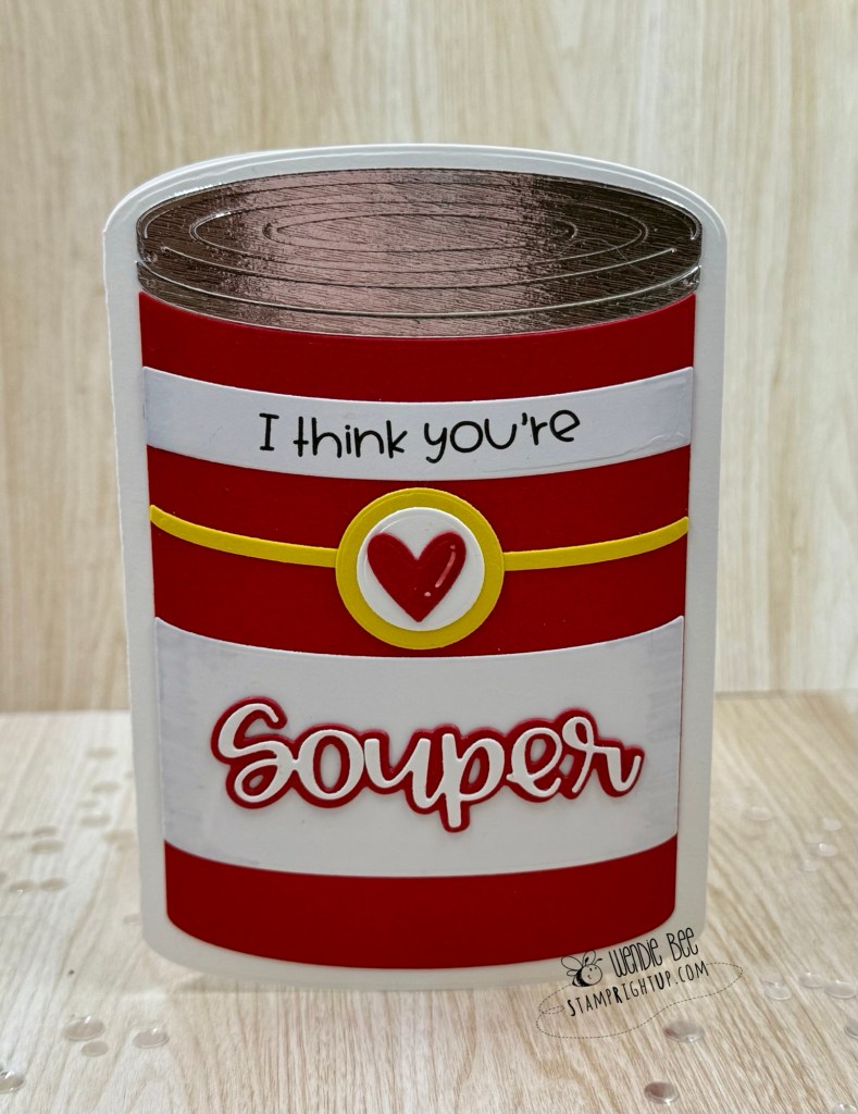
This might just be my favorite kind of comfort crafting! I had so much fun creating this shaped card using the Soup Can Card Die Set from Trinity Stamps — and let’s be real, who doesn’t love a good pun?!
This clever die set builds a full soup can card base, complete with embossed metallic “lid” details and bold wrap-around stripes reminiscent of a certain iconic pantry staple. I layered mine with classic red and white cardstock for a clean, bold look and added the included sentiment die and heart embellishment for a pop of sweetness.
The finished card is not only adorable — it stands up on its own, making it perfect for displaying on a shelf or desk. And while I went with a Valentine-esque “I think you’re Souper” theme, this set is incredibly versatile! Think get well soon, teacher appreciation, friendship, or just a warm note to make someone smile.
💡 Design tip: Use metallic or mirror cardstock for the lid to mimic real tin, and don’t be afraid to mix up the color palette for themed cans — think spooky soup for Halloween or festive tomato-chili for Christmas!
If you love shaped cards or just enjoy spreading punny positivity, this die set belongs in your stash.
Would love to know — what flavor of “souper” sentiment would you cook up with this die?
I have been trying to actually *use* supplies as I buy them, so when I purchased this Delighted For You stamp / stencil / die bundle from my local craft shop I made a point to use it!
When I saw this set, while I knew it would be versatile for color ways, but I immediately saw tiger lillies, so I chose a peachy-orange palette to start. The card base is Spellbinders Barely Peach (I think it would be Bellini equivalent now with the refresh)
The background was made with a technique I learned from the fabulous Gina K. I took a piece of 65lb card stock and scored it at every half inch; then I took the Honey Bee No Line colouring ink pad straight to the card stock (laying it flat down) and just lightly brushed it. That created that faux wood grain/ shiplap look.
Foiling sentiments is wonderful, but it’s a lot of work for me to drag out my glimmer machine, so I happen to have a pouch of pre foiled & cut sentiments from PinkFresh so I just popped one on from that stash.
A few baubles to fill in & balance white space and voila! A card done. It took maybe 30 minutes in total but I’m super happy with how it turned out.
If you’ve ever dreamed of building the perfect little paper house, the Our House collection makes it easier (and more fun!) than ever! This charming card was created using the Our House Dies, and I had so much fun personalizing it with all the delightful add-ons.
This die set is packed with customizable details — from interchangeable window shapes and scalloped roof tiles to flower boxes, balloon clusters, and banners! Whether you want to create a cozy cottage, a festive celebration scene like this one, or a wintery holiday home, the possibilities are endless.
The dies are perfectly sized to fill an A2 card front, but you can also use them to create a free-standing house-shaped card for something extra special. I used the coordinating Our House Extras Dies to add balloons and that festive banner, which I stamped using the Our House Stamp Set. The windows were lightly ink-blended for a soft glow effect, and the flower boxes add that perfect finishing touch.
Want to step it up even more? The Our House Embossing Folder adds dimensional brick textures for even more realism and charm.
Whether you’re making a card to celebrate a birthday, new home, retirement, or just because — this collection lets you create a scene full of personality and joy.
💡Pro tip: Mix and match elements with other seasonal sets for year-round versatility!
Thanks for stopping by — and don’t forget to tag me if you make a project using this set. I love seeing your creations!
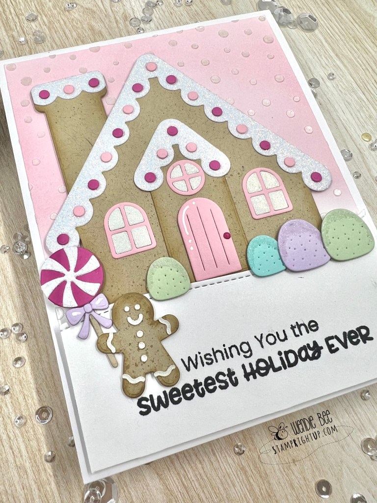
My Favorite Things really hit it out of the park with this Gingerbread Greetings card kit! The second I saw a preview I knew I had to have it.
Using the MFT snowfall stencil with Lawn Fawn pearl paste over a lightly blended distress ink background with spun sugar I recreated a background from one of the design team examples.
Using Kraft card stock with a very light splatter of Distress Oxide ink in gathered twigs to give it some texture, I also added just a light hint of shading to all the gingerbread pieces with Oxide gathered twigs as well to give it that freshly baked look.
I love this kit, and have so many more ideas on color combinations to use and various layouts I can do.
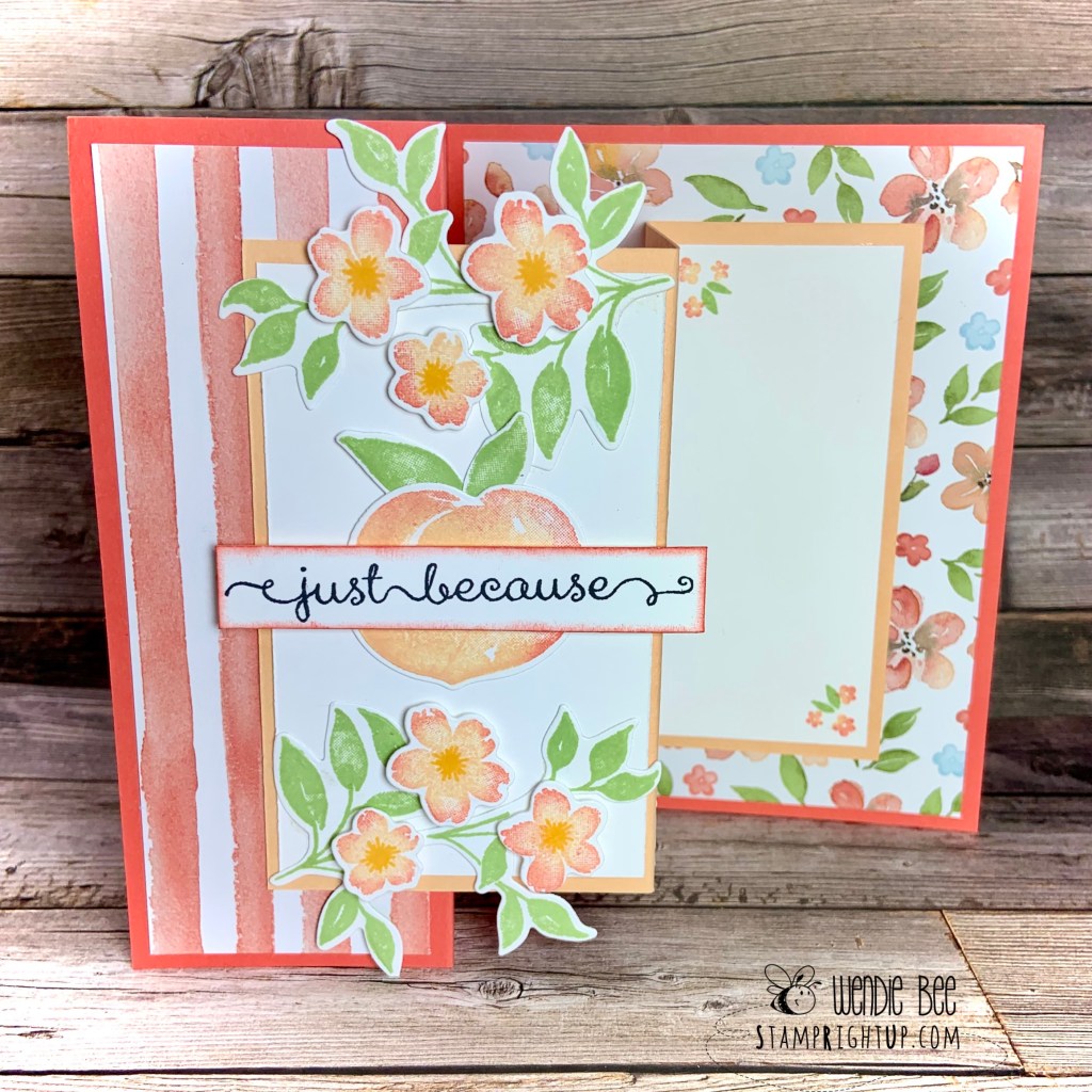
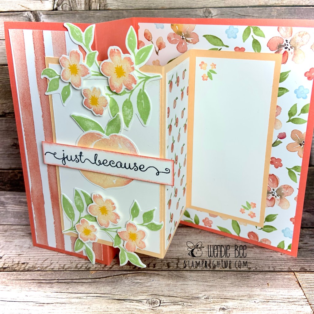
I just can’t get enough of this Sweet As A Peach stamp set!!! CASED from a pin on Pinterest, I modified the design to make it my own.
Using sponge daybeds to add that hint of secondary colours on the flowers, peach and leaves is such an easy way to add dimension to the stamped images.
Sweet As A Peach by Wendie Bee Stamp Right UpSweet As A Peach by Wendie Bee Stamp Right Up
Of all the alcohol markers that Stampin Up has, Cherry Cobbler is my favorite color. It is such a rich yet vibrant color, almost regal like velvet 😉
I am hosting an Introduction to Alcohol Marker Coloring class this week, and here is the card the group will be making in the workshop. Each class participant will get a FREE pack of the Cherry Cobbler marker trio as part of their class fee too!
Here is the card:
Cherry Cobbler Blendabilities Blended Bloom by Wendie Bee of Stamp Right Up Canadian Stampin Up Demonstrator